How to make your app look great on Glitch

An important part of our approach with Glitch is to start folks off from a working example app. Rather than starting with a blank screen, we want Glitch users to see something working as soon as possible, so we’ve made a ton of apps you can use as jumping off points.
But this isn’t some closed shop — anyone can submit an app they’ve created to our community gallery for others to see, use and remix!
Here are a few tips we’ve put together about how to make a really great project listing.
The contents of your project’s readme.md file is what gets shown in the community gallery. Think of them as more like an App Store description, rather than a typical GitHub readme. This is your spot to get people interested in your project, so it should really sell it.
It should cover what the project does, why it’s useful and what users will need to do to get their own version of the project working (adding in API keys etc.). Keep it short — around 100 words total.
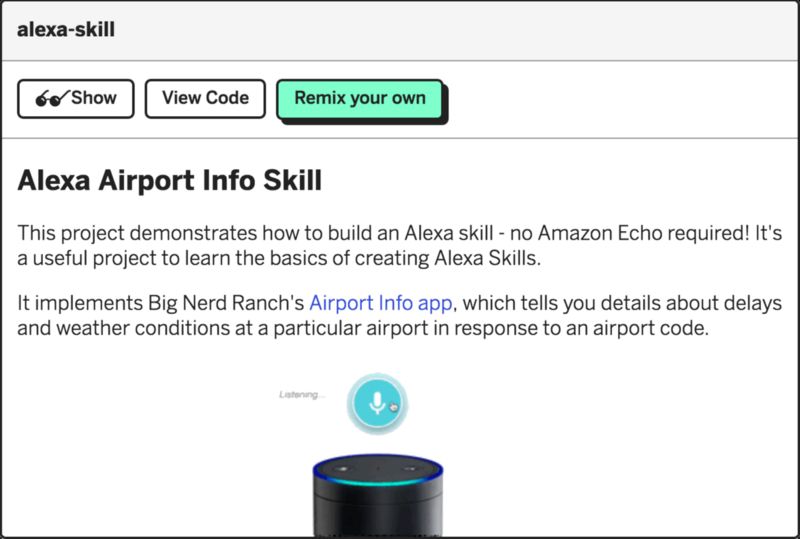
Your description is the place to show folks what your project looks like and how it functions. Include a screenshot, or even better, a gif (*we know that not all projects photograph well — backend libraries, utility frameworks etc. don’t lend themselves well to imagery, but even a gif of the example app using your code helps to get some information across.) — *animation conveys things way better/faster than static text or images.
If the setup instructions are more than a few lines, then add a setup.md file to your project and use that to go into the detail.
Be prescriptive and try not to make too many assumptions. We want projects to be accessible to a wide audience with differing skill and knowledge levels. So avoid jargon and acronyms whenever possible. See an example.
Code explanations should be included inline within the code files themselves as comments. And be sure to remove any extraneous dependencies and unused code.
Set your project avatar — it’s a 200x200 file, but they’re often shown at 33x33 and 18x18 on the site and in the app, so they should display well when small.
Also set your project description and a relevant project title, which also functions as your project’s URL.
Once you’ve finished crafting the perfect listing, submit your project URL to The Gallery topic on the forum. You can also share your projects on Twitter. Hashtag them #glitch so we can be sure to see and share!
We’re excited to see what you come up with!
