Visualizing responses from Data for Progress' Presidential Primary First Debate Survey
As the 2020 Democratic Primary approaches, progressive candidates, engaged voters, and the media are deepening their understanding of how Americans think about the issues currently facing the country and our world. Through research and polling, we are learning that the “way Americans think” as defined by conventional wisdom may no longer reflect our reality, particularly when it comes to issues like climate change, immigration, and economic inequality.
In July of this year, YouGov Blue conducted the Presidential Primary First Debate Survey on behalf of Data for Progress, which opened the door to public opinions on these issues. In order to provide more access to the results, here at Glitch we made a visualization tool to explore responses to each question based on a set of demographic filters. And the best part is that it’s totally customizable!
About the app #
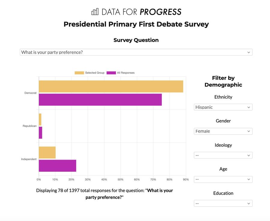
The app allows you to see the results for individual questions in the poll and provides several demographic filters to narrow down the data based on ethnicity, gender, ideology, age, and education level. As an example, here is the data for the question, “What is your party preference?” filtered to only include respondents who identify as Hispanic and Female:

After selecting filters, the app shows the question’s response breakdown for both the selected group and the total responses, as well as the number of responses to that question that match the filter conditions. By drilling down into the data, we can see that based on the respondents of this study, folks who identify as Hispanic and Female are more likely to also identify with the Democratic party than the larger group.
How it works #
The data that powers this project lives in a separate app using a tool called Datasette. Datasette provides data journalists with a web application for exploring and querying large sets of data, and includes convenient tools for converting CSV files into a SQLite database. To start building this app, we put all of the survey response data into Datasette so it could be queried -- you can see that project here.
Having the data in Datasette enables us to query the data using SQL (Structured Query Language), a common language for interacting with databases. This makes the communication between the two apps fairly straightforward: When you create a filter in the visualization tool, the app translates that filter to a SQL query and sends it to the Datasette app. The Datasette app then uses that SQL query to retrieve a subset of the data based on the filters and returns that data to the visualization app, where it is displayed.
Make it your own #
We made this app to show what is possible in terms of exploring survey data, but our example is not a comprehensive report of every response to the Presidential Primary Debate First Survey. If you’re interested in exploring the data beyond what’s in our app, you’re in luck! You can create your own version of this project focused on the questions and demographic information that are most important to you.
Here’s how to do it:
First of all, remix this app! Remixing will create your own copy of the app that is unique to you -- any changes you make will only apply to your version. Make sure you change the description in your version so you remember what the app does when you're looking at it later.
Once you have your own version of the app, you can start making changes.
Changing filters #
To dig into the data you will need to add topics and/or demographic filters. You can make these changes in index.html.
- The topics live in index.html starting on line 39. There is an example showing how to add a new topic starting on line 73. For a list of topics, see topic-abbrevs.md.
- The demographics live in index.html starting on line 87. There is an example showing how to add a new demographic option on line 154. For a full list of demographic options, see topic-abbrevs.md. NOTE: if you are adding or changing demographic filters, you must also update the list in script.js as shown on line 56.
Other changes #
Here are other ideas for ways to make your own app:
Be the change! #
Making data more accessible is one crucial step to building an informed community. How are you using technology to share information? We’d love to hear more about it! Tweet us @glitch.

